UX|UI Design
airBuddy
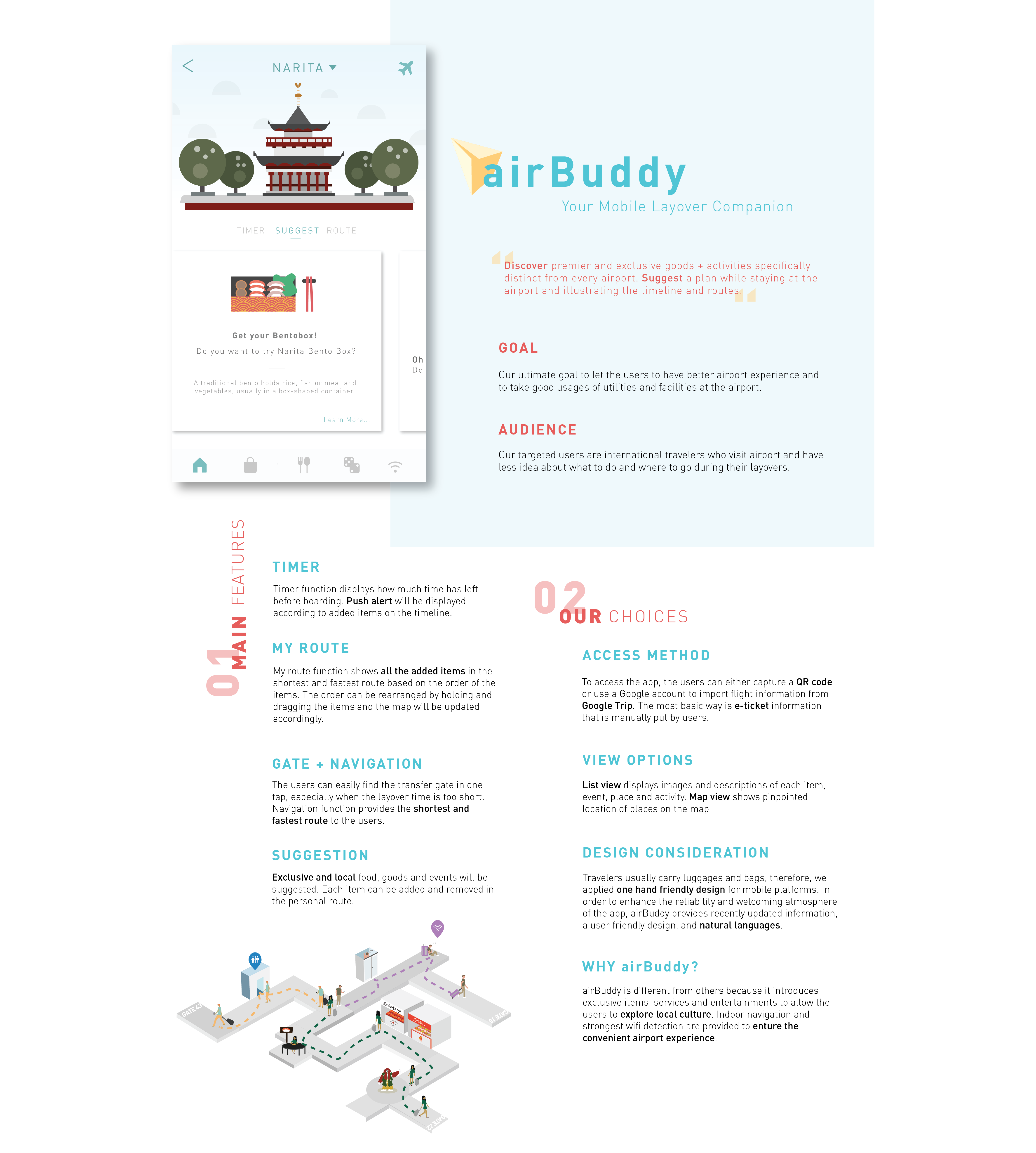
airBuddy is a layover companion app designed to discover and plan your time used in every major international airport. My team and I produced this project for an interface design class within seven weeks.
Our goal throughout using the app is to discover exclusive premium goods and activities specifically for every airport. We would like to suggest a plan while staying at the airport, to illustrate potential timelines and routes. Our ultimate goal is to give our users a better airport experience by efficiently letting them utilize different facilities around the airport.
- Responsibilities
- Research + Strategy
- Illustration
- Interaction + Layout Design

What and Why We Care—Often people get frustrated emotionally, and they also get lost physically during the layover.
My team found that almost every frequent traveler has been stuck at an airport due to weather problems, mechanical issues or flight delays. Some passengers complain a lot to the front desk when flight delays happen. We, as a team, wanted to build an app that helps international travelers to have a better airport experience and take good usages of utilities and facilities around the airport. The users can plan their layovers by discovering premium and exclusive foods, entertainment, as well as souvenirs specifically from each airport.
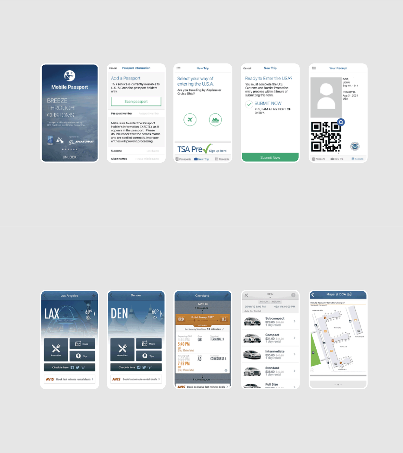
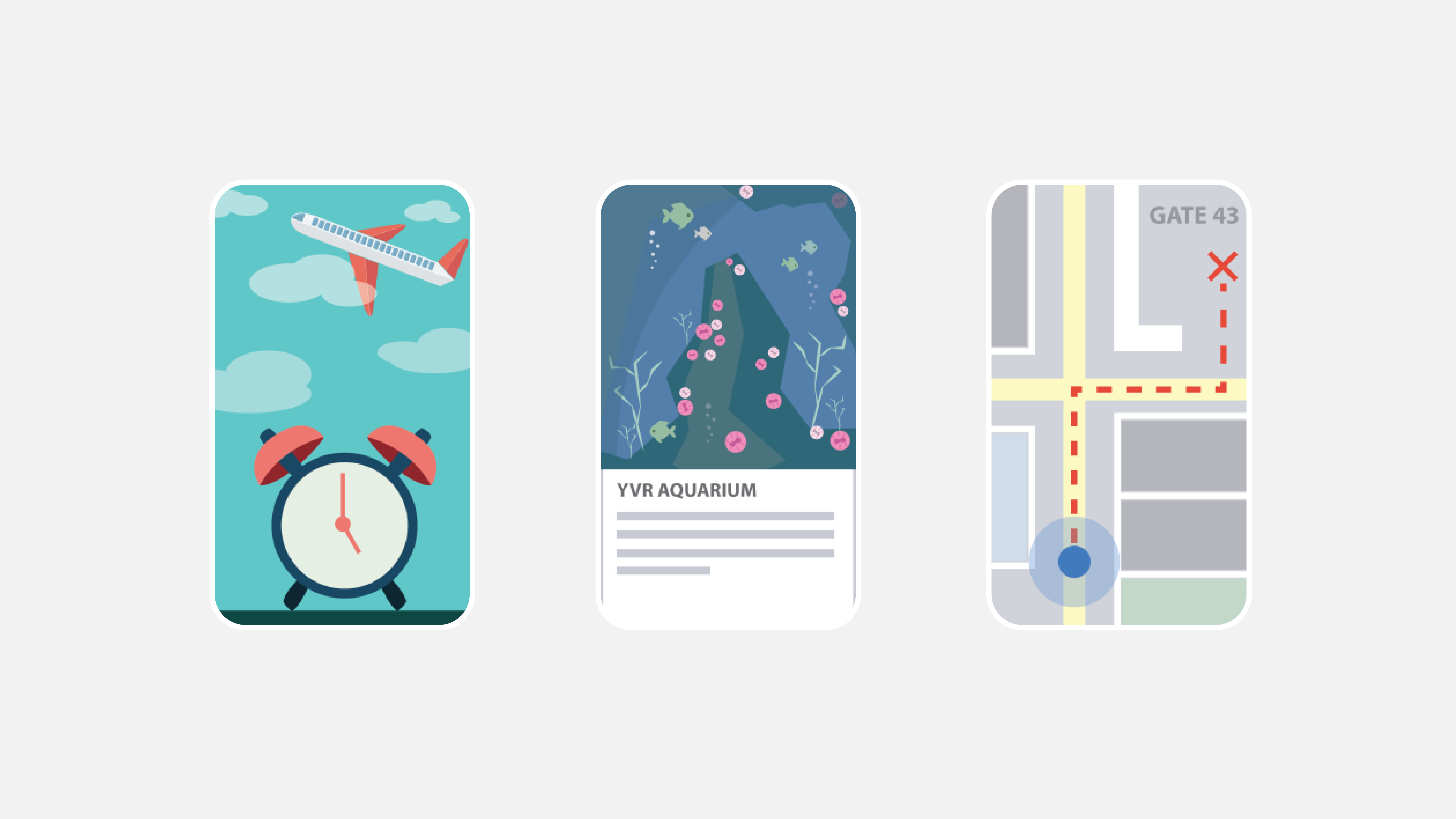 [1] Interface design of GateGuru and Mobile Passport, [2] airBuddy—Initial Design Concept
How We Are Different—Understand industry standards and Identify opportunities for the product within our particular niche.
We have tested many other airport apps out there. The main issues that we found with these apps were that the overall look and feel of the interface were very dry, dead, and aesthetically displeasing. This made the users not want to utilize them. Along with this, the contents were not very well organized and the information was all outdated. After noticing these issues, we decided to create a user friendly design, which contains a natural language, welcoming style, that allows the users to comfortably navigate through the app.
Our Choice & Interface Development
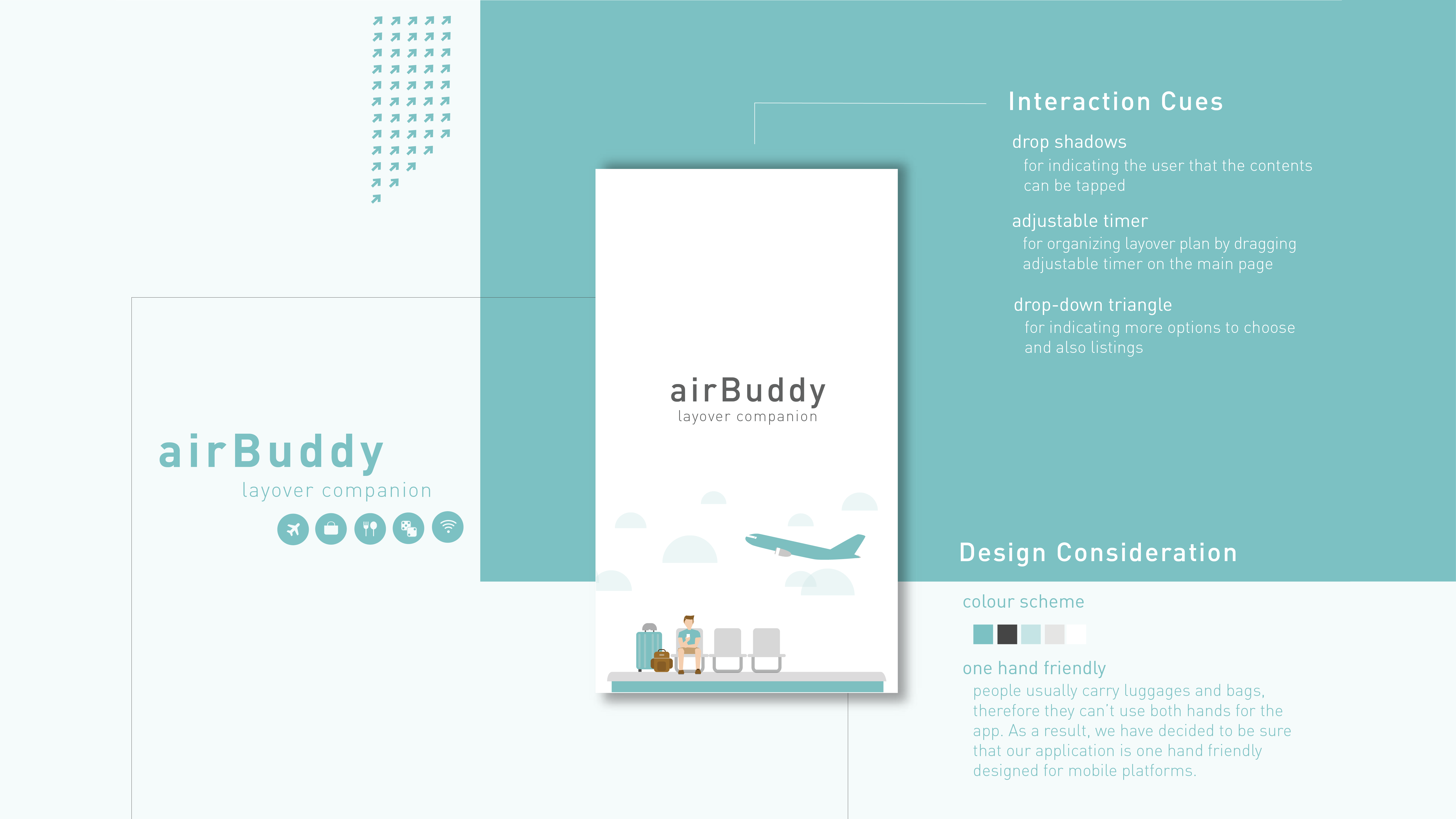
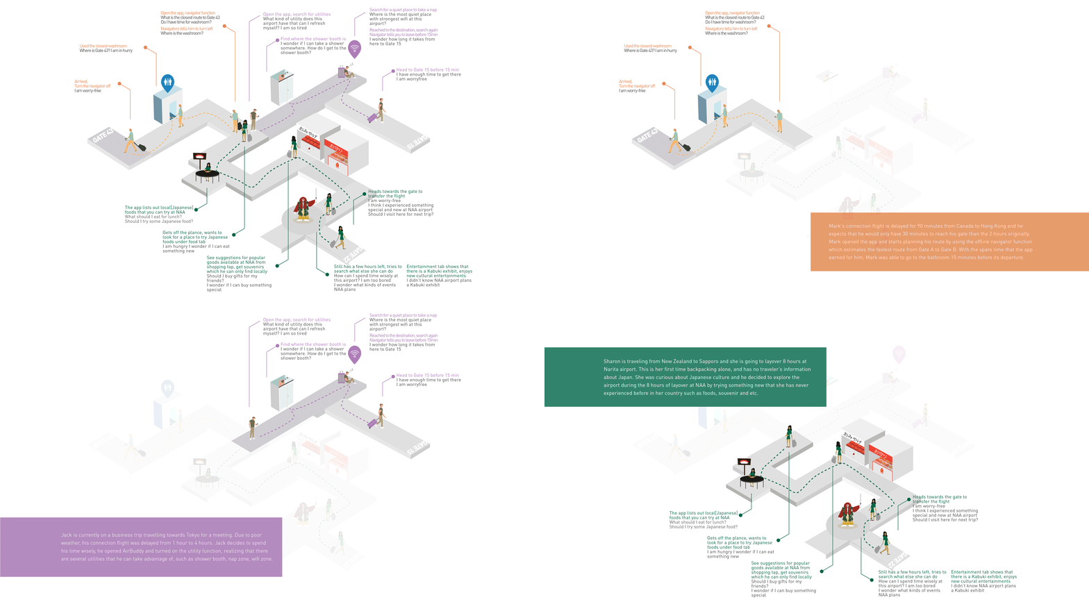
We started to build up the app based on our style guide and the scenario/journey map as shown above. People usually carry luggages and bags, therefore they can’t use both hands for the app. As a result, we have decided that our application is one hand friendly designed for mobile platforms. The circulation of the app is designed in a way that there is no dead end, and users can constantly interact with it.
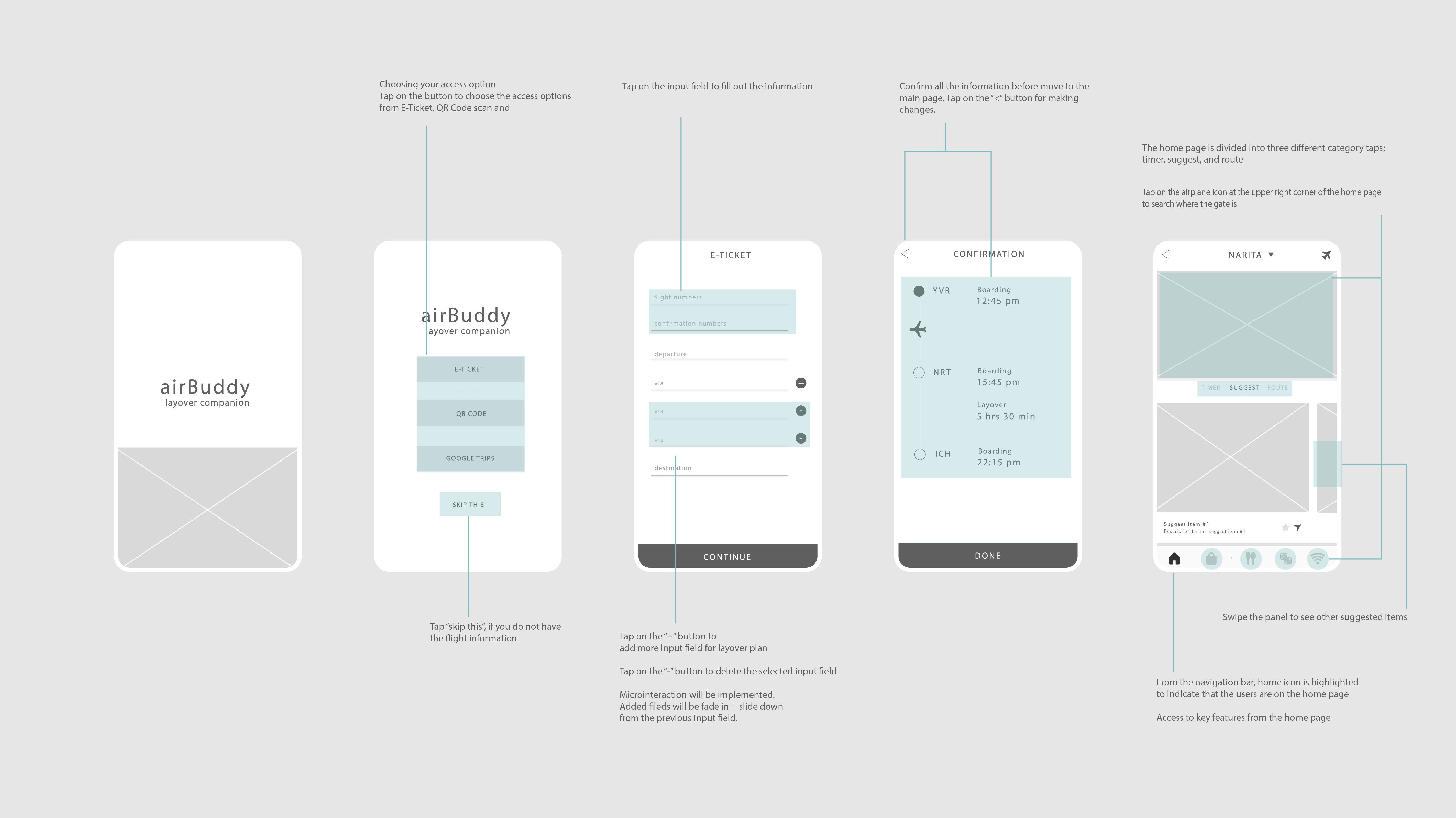
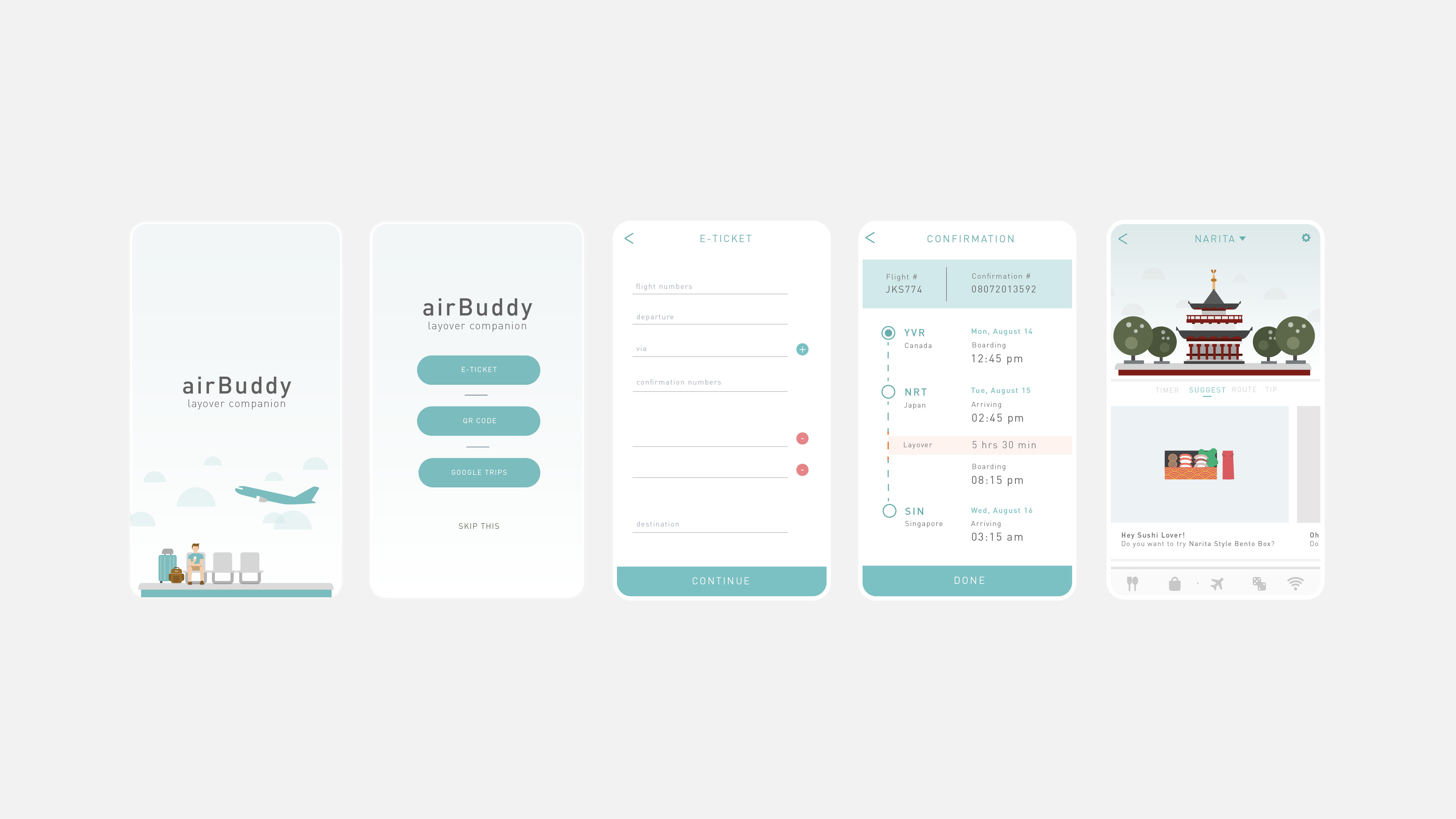
Based on the idea and concept, our group tried to come out with feasible wireframes and interface design. At this point, flow/circulation of the app was our main consideration. We started off with the wireframes, from low fidelity to high fidelity, and then designed the interface with illustration based graphics to meet our goal.
In order to enhance the qualities of interface design, we have conducted user testing, which was done through interviews and think aloud testing. From the user testing, we found out that there were some visibility issues, so the user was not able to read the contents well. As a result, we have modified the look of icons and removed uncleared and unnecessary interactive elements.

