
Product Design Case Study
Hapdog
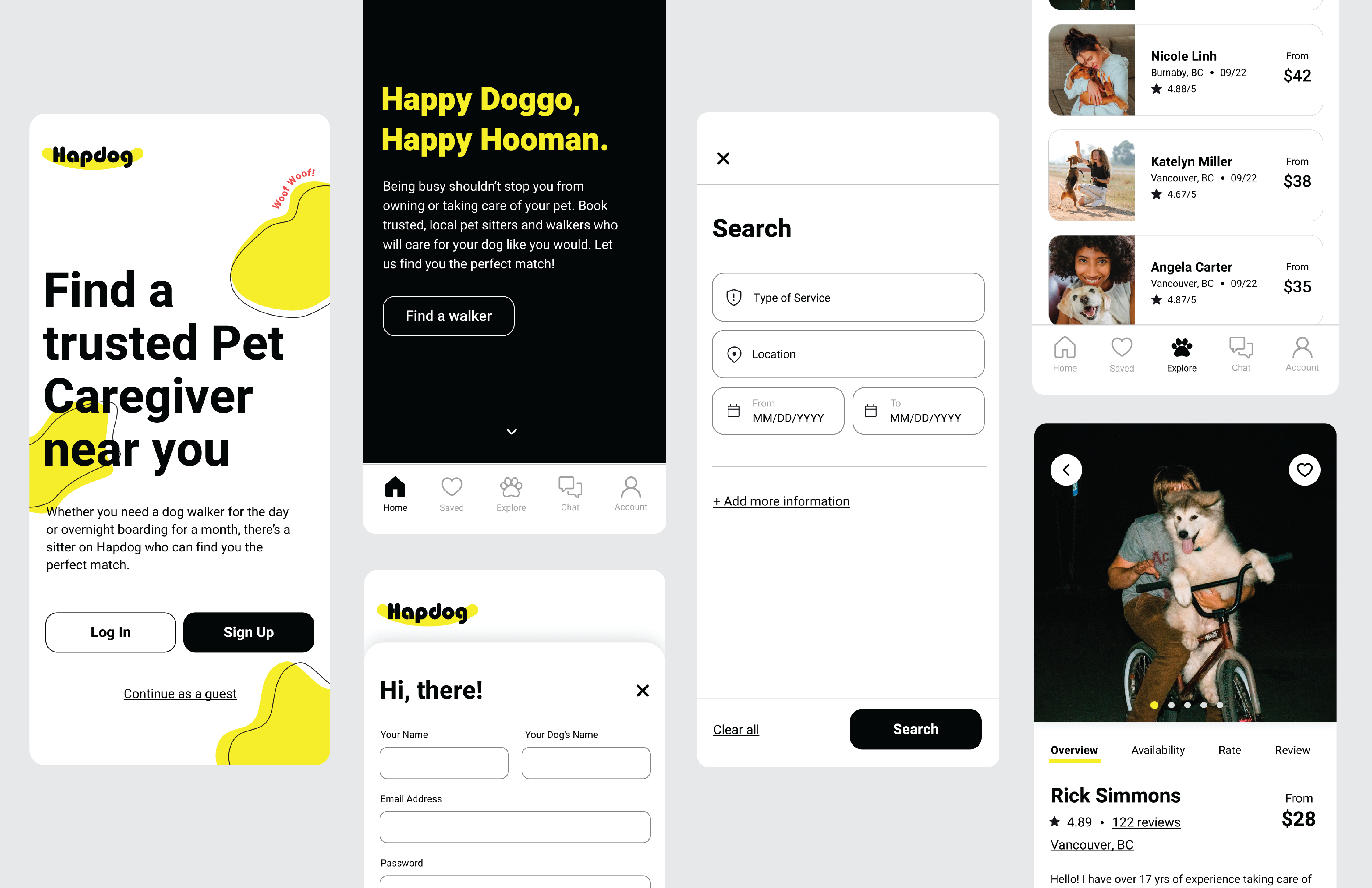
Dog owners sometimes need help caring for and walking their dogs. Hapdog is a native app that helps the busy dog owners to find a trusted pet caregiver near them. I, as a product designer, have considered about users’ needs and focused on how to overcome the challenge in the most efficient way.
I have solely worked on overall branding and both UX/UI design of the app during a sixteen week Product Design course at Dribbble. Before I dive into the project, I have done plenty of research to define the user and business requirements. During the ideation process, I have created multiple versions of wireframes in low-fidelity and developed them into high-fidelity prototypes based on the test results and feedback I received.
01 Defining the Problem & User Research
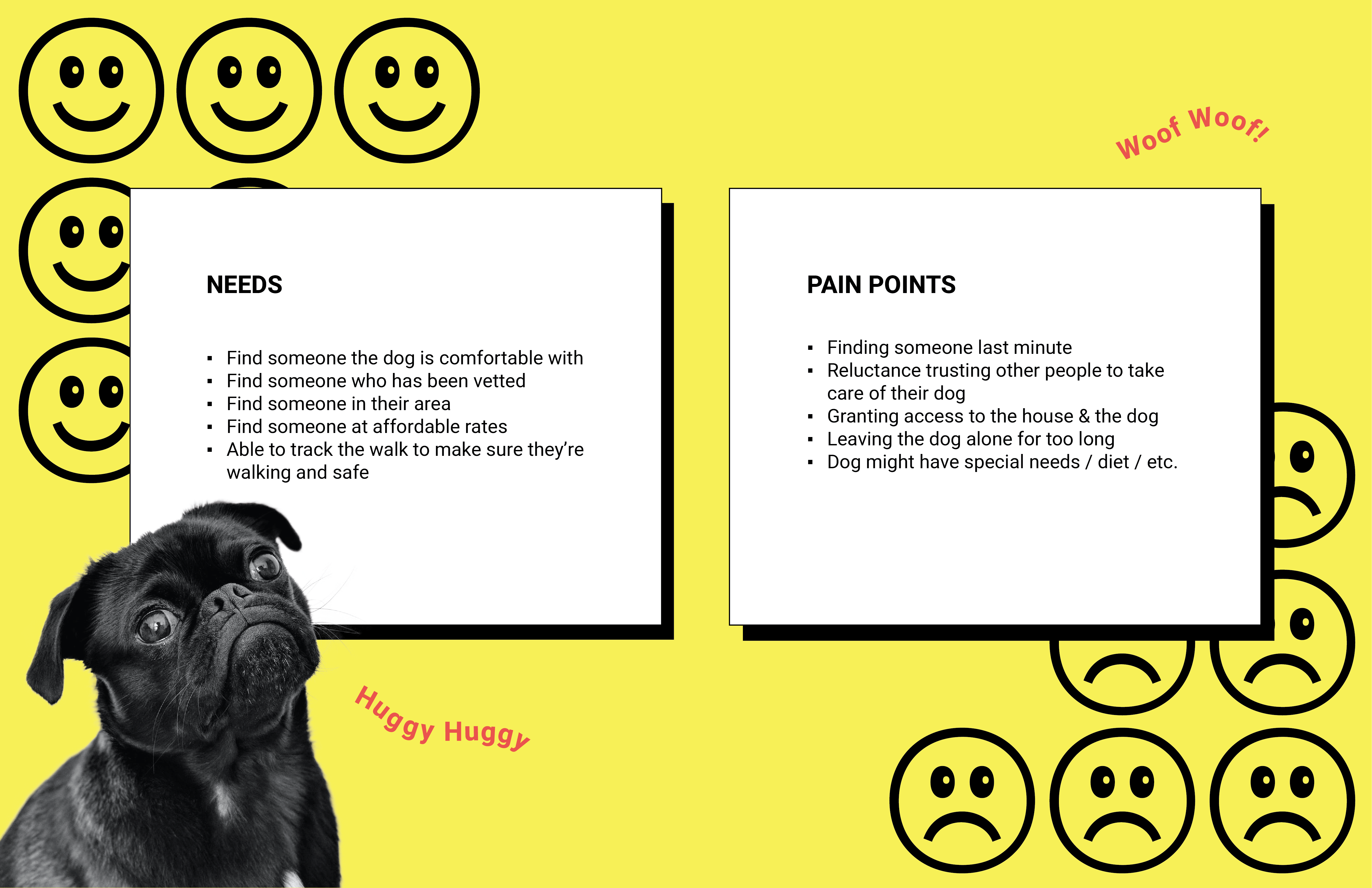
Who are the users and what is the problem? What do they need and how can I help?
There are two types of users; dog owners who need help caring for and walking their dogs & dog walkers/sitters who love dogs and would like to spend time with them. Friends and family are usually the main resources for dog-sitting, but they are not always available to help the dog owners. Both users want to experience safe and convenient booking system. Due to the time constraint, Hapdog has selected the dog owners as the main user and created a series of project goals accordingly.
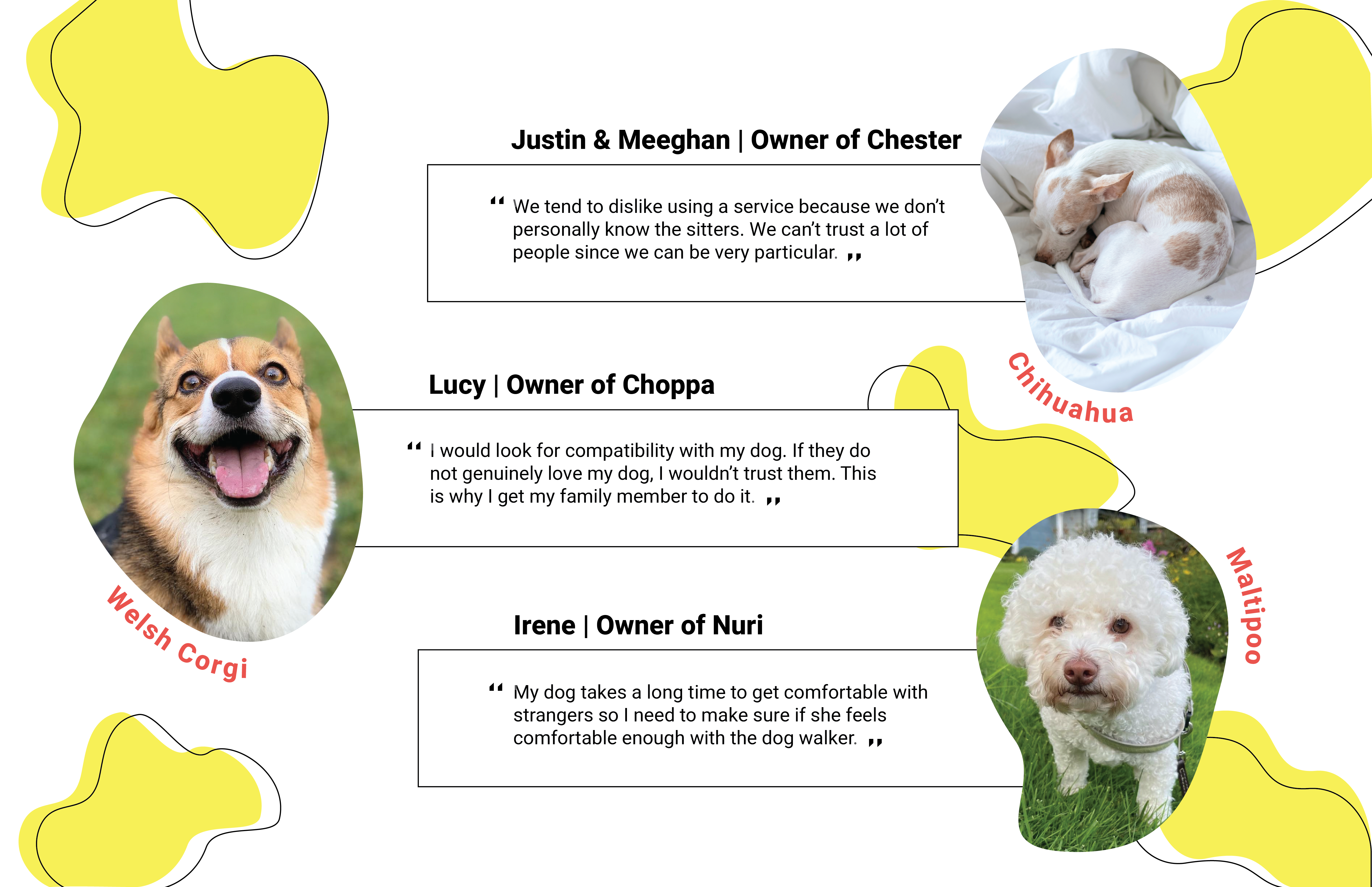
I have interviewed three potential users; dog owners. They have never used any dog walking or pet sitting service before, but they all have asked their family or a trustworthy friend to take care of their dogs. Throughout the interviews, I have found safety and compatibility are the most important things they are looking for. They all have mentioned they would like to get to know them first because the reviews and profile on the app/site are not enough for them to choose the dog sitter. Also, I have found It might be easier for my interviewees to find the dog sitters since they own fairly small sized dogs and their family members live nearby.
- Key Takeaways
- ∙ Have ‘Contact’ or ‘Message’ feature available before booking a dog walker/sitter.
- ∙ Target the main users as busy living alone dog owners who own a large sized dog since they would be the people who are in need more.
02 Competitive Analysis & Persona
How are they trying to solve the problem? Who are the target users?
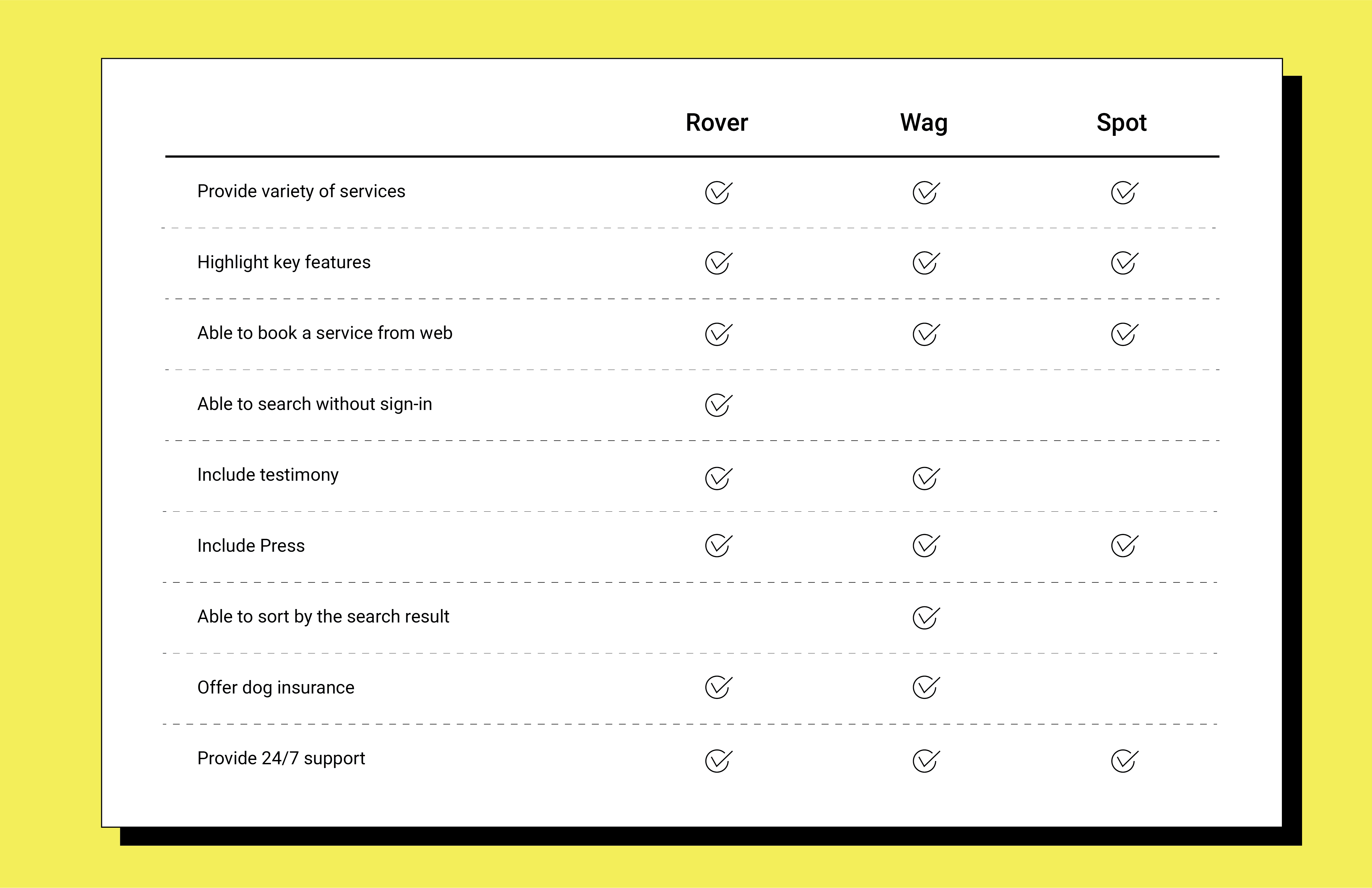
I have done the market research of three existing web or mobile platforms; Rover, Wag and Spot. My main focus was on their onboarding and booking process. Each has their unique selling points and strength, so my goal throughout this process was figuring out what they are and how I can improve and apply to Hapdog. Rover is the one that I’ve found the easiest and cleanest interface to complete the task. It has multiple ways to access to their booking page since they have many call-to-action buttons available on different pages. They have filter option and contact a dog walker feature available which makes the service more comprehensive. However, all three apps could be done little better in terms of design since some pages look crammed with full of information and they are hard to do the quick glance as the users.
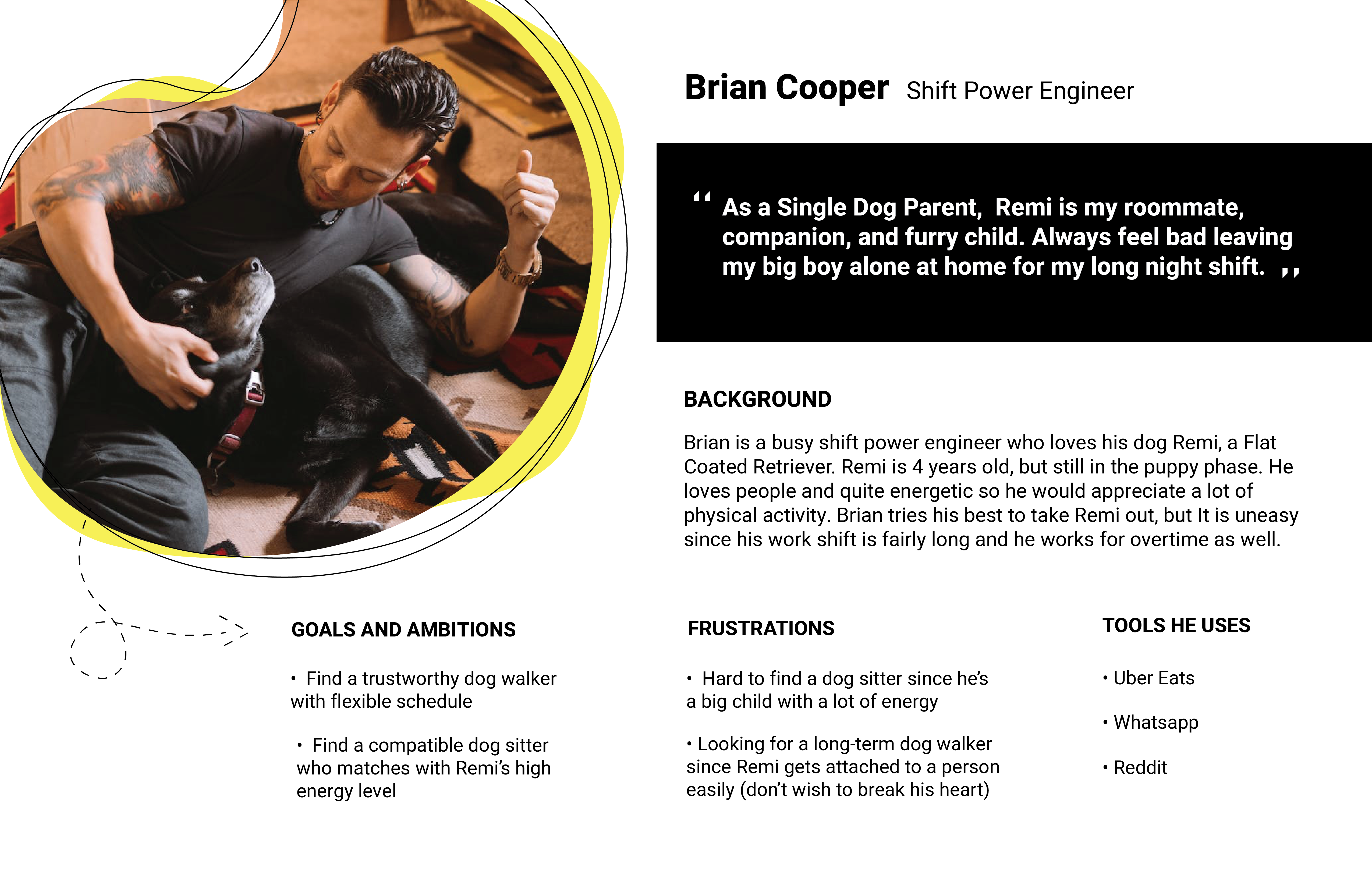
Throughout the research process, I have decided to set my persona as a large dog owner who does shift work. I’ve thought they are the people who are likely to use the app since they need more support to take care of their dogs.
03 User Flow
How to present the right information at the right time without having any friction?
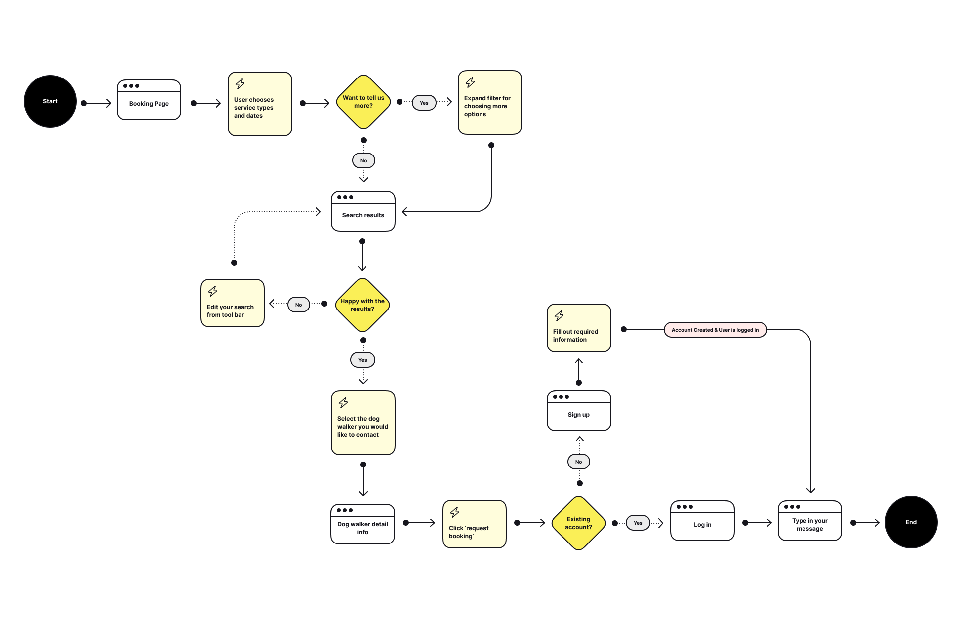
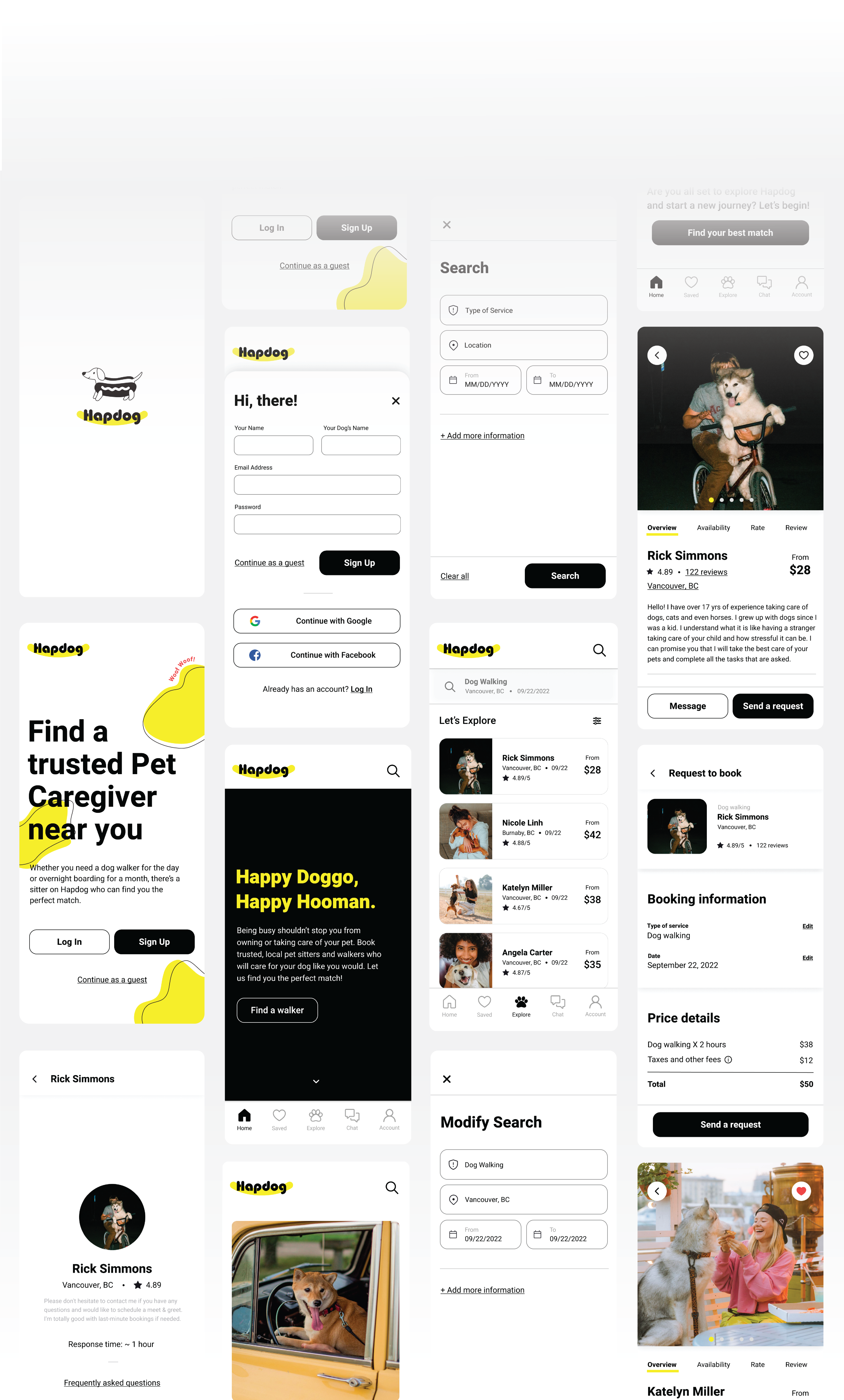
I've wanted the users to achieve their goal easily, but still with the options provided for those who want to deepen their experience. In Hapdog, the dog owners get to choose what kind of service they need on which date. That’s all they need to provide. Once they pick the service type and date, they are able to access to the search results page right away. However, they can still add more information to filter out the results if they need. Sign-in or sign-up do not required for the search process. You need to log in only if you actually want to book for a walk or need to chat with the walker. My goal as the designer is asking the minimum amount of information in order to reduce the total number of taps/clicks required to reach a goal.
04 Wireframes
How to layout content and functionality on each screen?
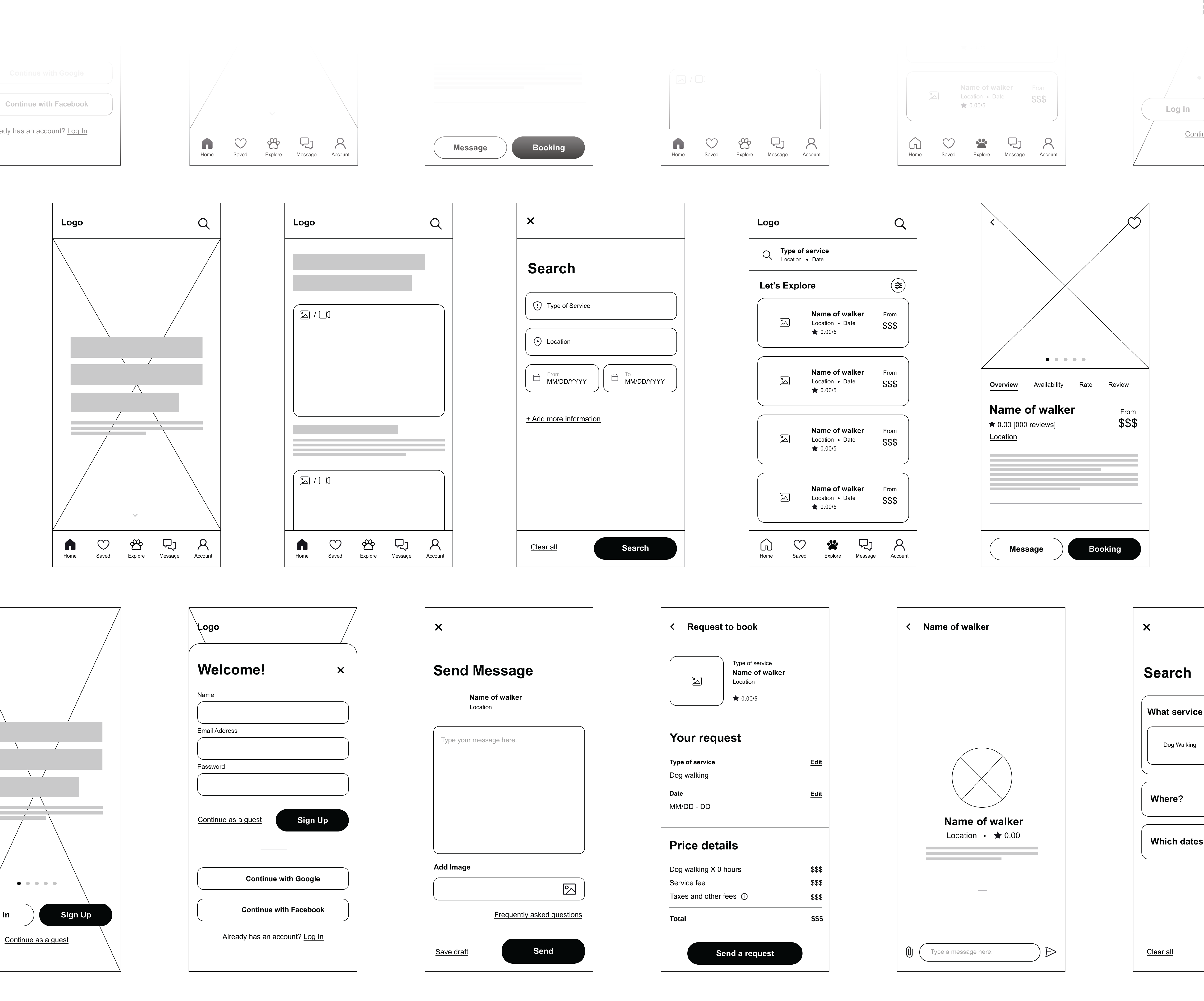
I have made few different versions of wireframes for onboarding and booking process. I started off with rough sketches, then developed individual rough pages into low fidelity to high fidelity. During this phase, I had to make decisions consistently on what to include on each page since I did not want to overwhelmed the users with excessive information nor causing frustration with lack of information. Most of the changes were made based on feedback from the mentor and user testing. I tried to focus on the overall flow and avoid making any confusion to the users.
05 Visual Design
What would make them look more visually pleasing?
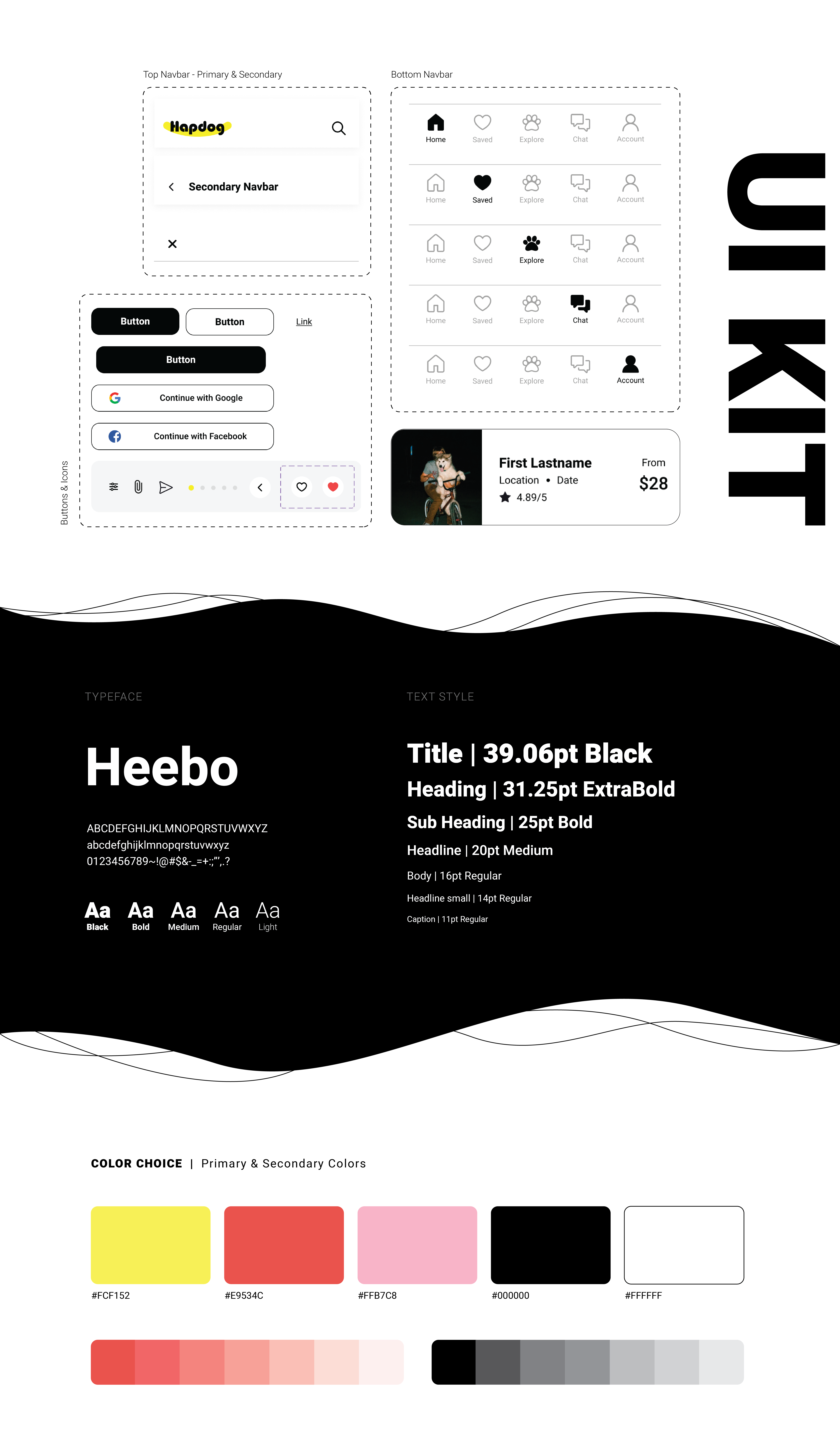
Before I jump into the visual side of the app, I have created a mood board to gather references from relevant topics and keep myself inspired. Once I completed the stage, I started picking typeface and theme colors for the app. I wanted it to be looking friendly, playful, clean and modern. Therefore, I have decided to use monochromatic tone for most of the texts to keep it clean and accent color for the call-to-action buttons to look more playful. Some illustrations are added to emphasize friendly vibe. After completing the major part of visual design, I put all the components on my UI kit with auto layout and variants active.
06 Prototype and Testing
Are there any issues and how can they be improved?
After making every page interactive and functional, I have asked few people to run prototype testing. From the first test, I have received feedback that some navigations are not very clear. As a solution, I have added couple more call-to-action buttons to reach search result page and rephrased some words to have better delivery. Once I make all the changes, I have ran another test with different user and updated the prototype based on the feedback I received. This whole process helped me to identify the problems that I was not able to recognize. It also made me to realize once more about users’ needs and expectations.
07 Outcome and Result
What are the key takeaways?
There are many lessons that I have learned after completing this project. One of the biggest takeaways for me is how important understanding users’ pain points and needs are. Personally, I’ve found It is little difficult to keep these in mind once I started working on visual part of the project. Prototype testing was the great way to remind me of users’ perspective and their goals.