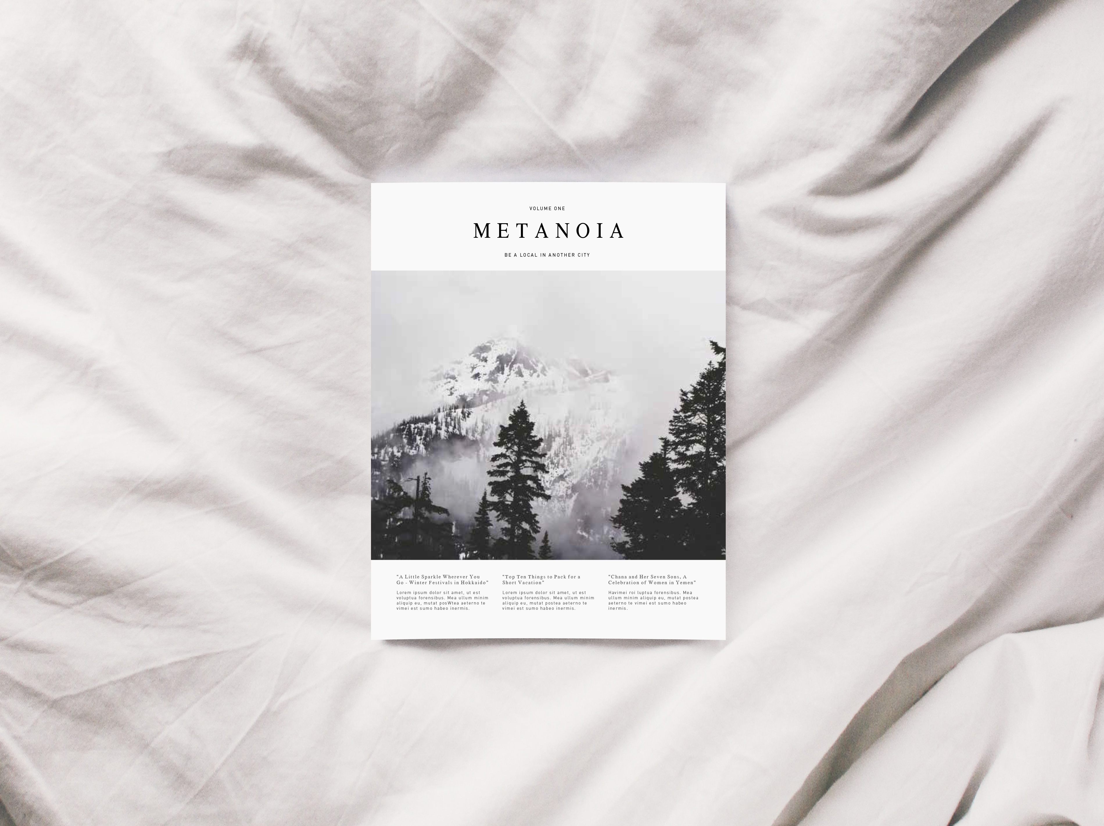
Art Direction
Metanoia
Be a Local in Another City
Metanoia is a travel magazine that targets the female audience specifically. My team and I produced the project for a magazine designing class within two months. Our main goal is to share lifestyle and travel information. Along with that, we also strongly direct our efforts into producing articles that inspire, empower and inform the women demographic. Our mission is to provide a journey into changing our reader's mind, heart, self and way of life.
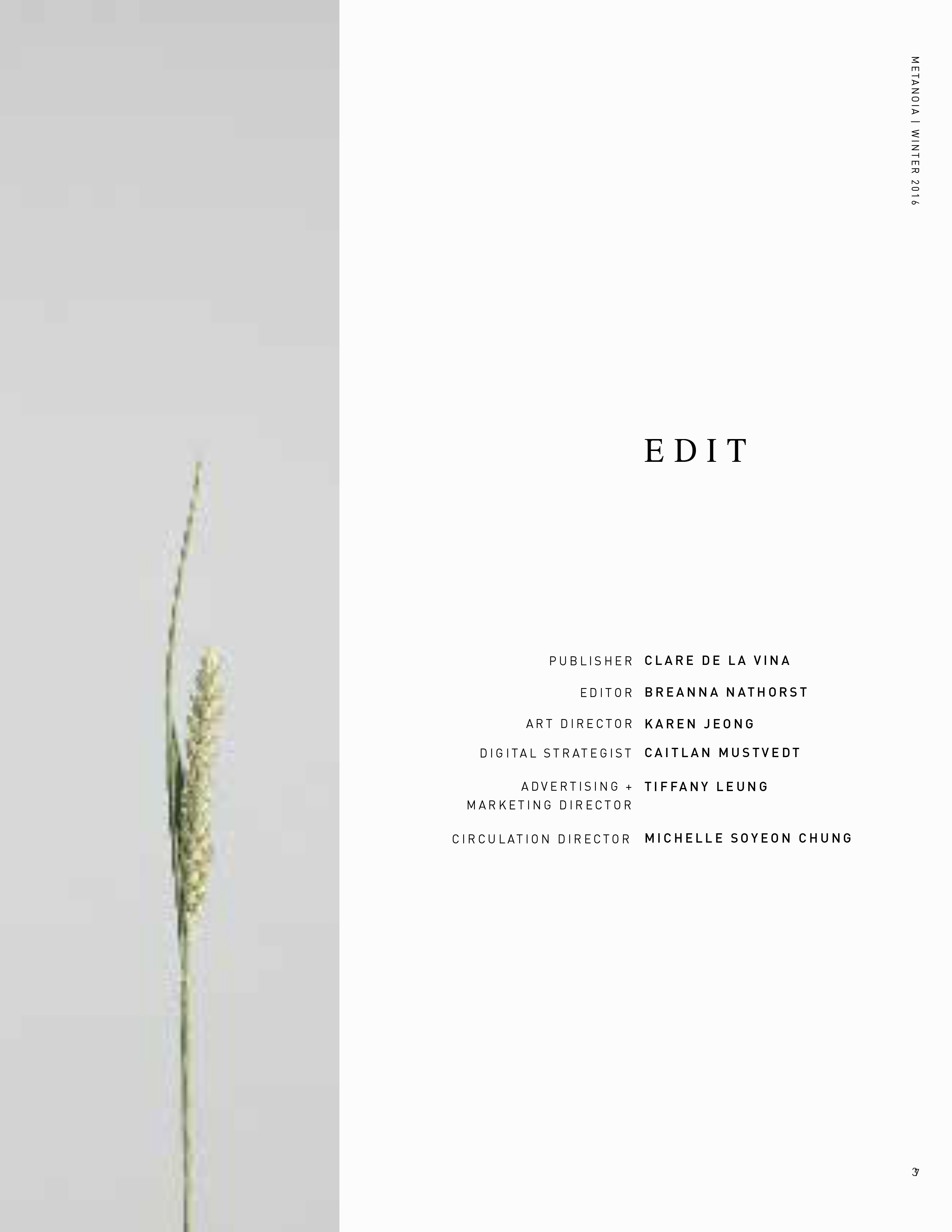
- Collaborator
- Clare de la Vina
- Breanna Nathorst
- Caitlan Mustvedt
- Tiffany Leung
- Michelle Chung
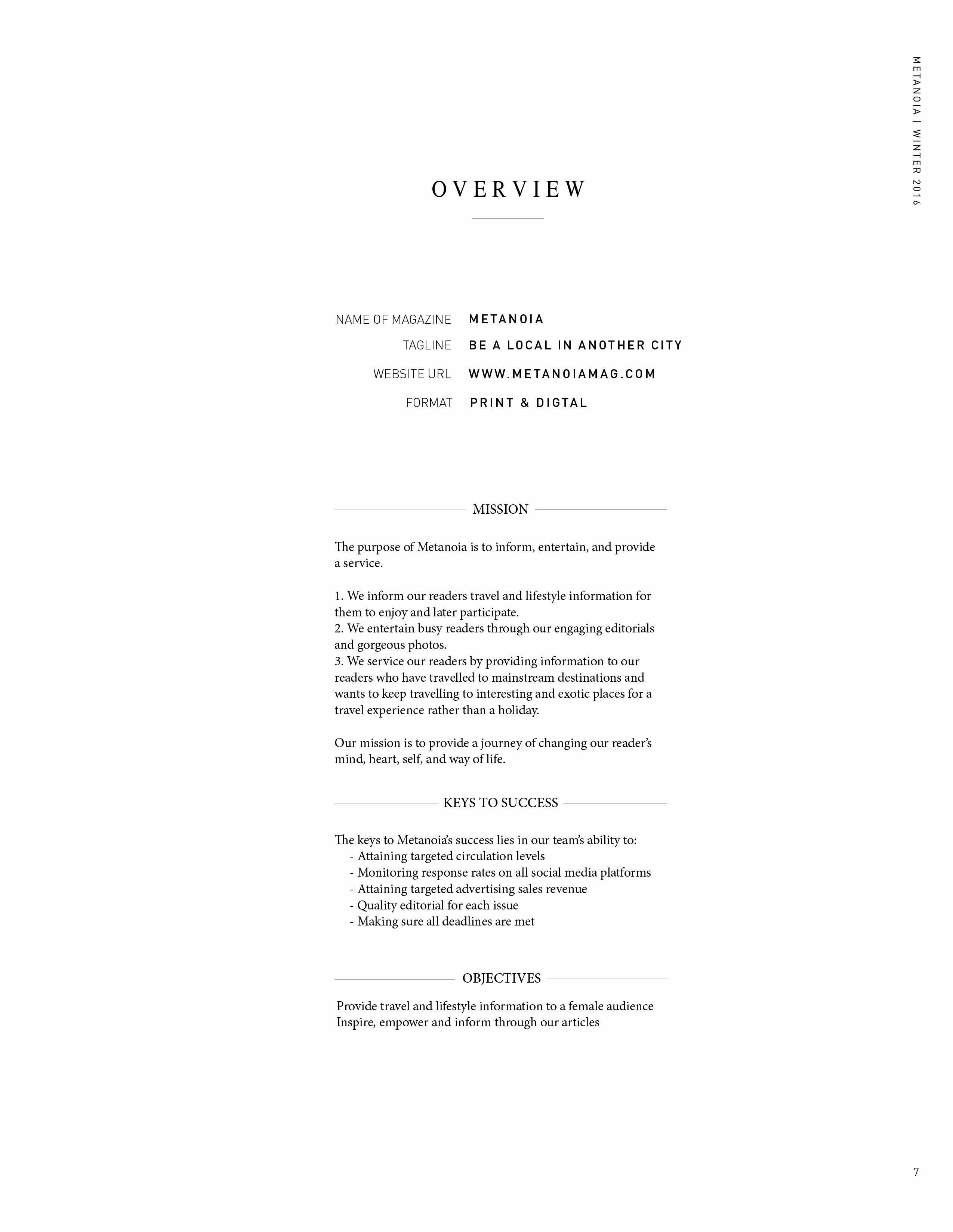
Editorial Niche—We are the solution to their reading wanderlust and in doing so, we promise a transformative journey for the heart, self and way of living.
To fully capture the essence of Metanoia’s tagline: “Be a Local in Another City”, our editorials encompass a lush variety of articles on how traveling ultimately becomes synonymous to community-building. Every quarterly issue boasts a multifaceted array of stories — drawing inspiration from the daily lives of local women, citing current and/or historical information on every city, as well as guiding articles for those who intend on living the travel experience. On the whole, the best way to describe Metanoia’s voice is that it acts like a travel companion through its editorials.
Visual Concept of Metanoia I
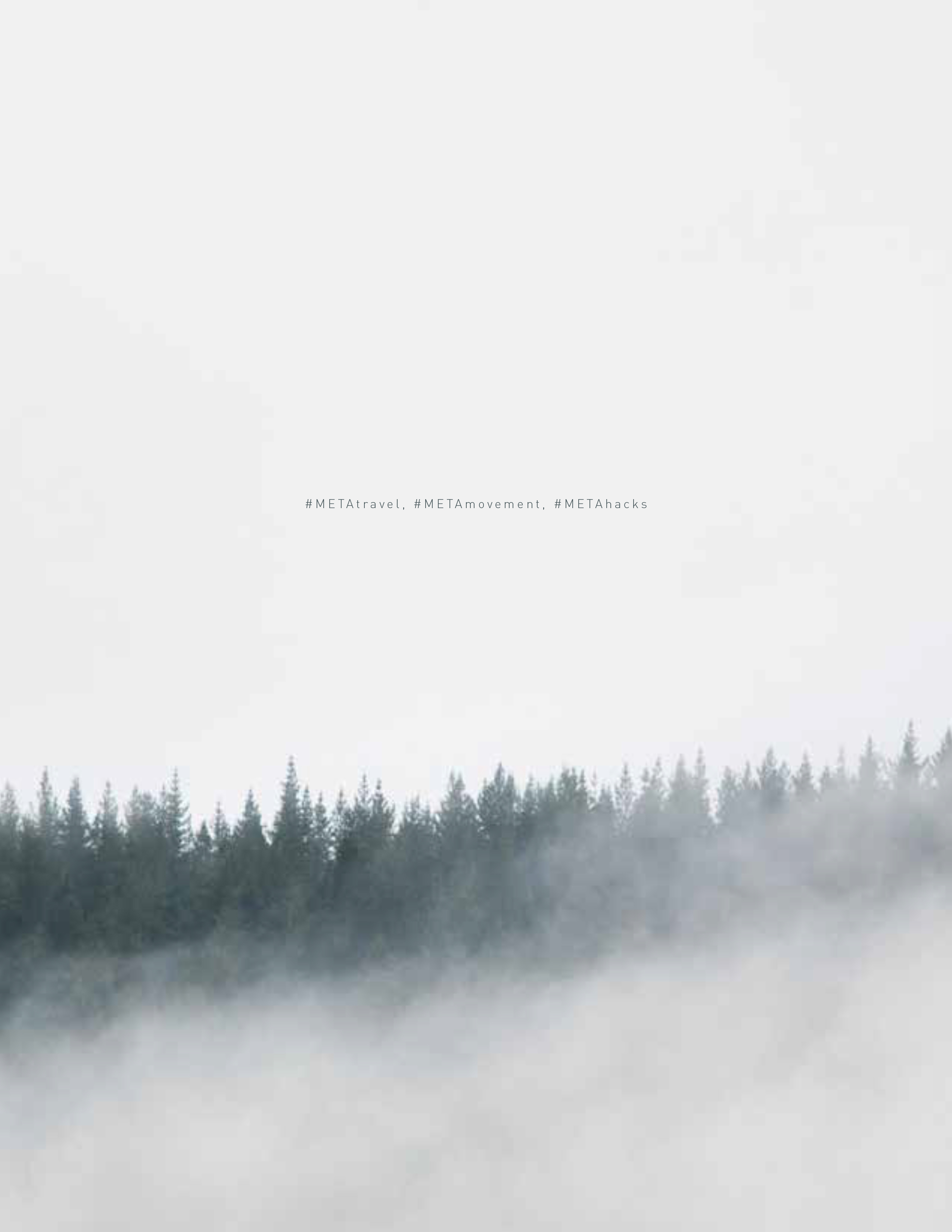
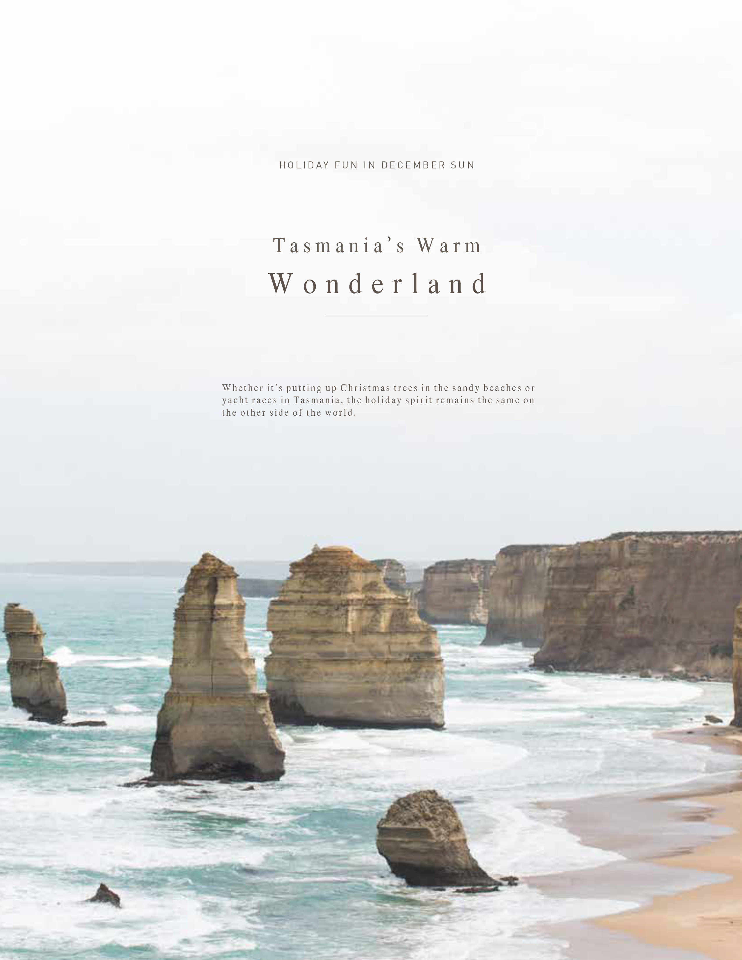
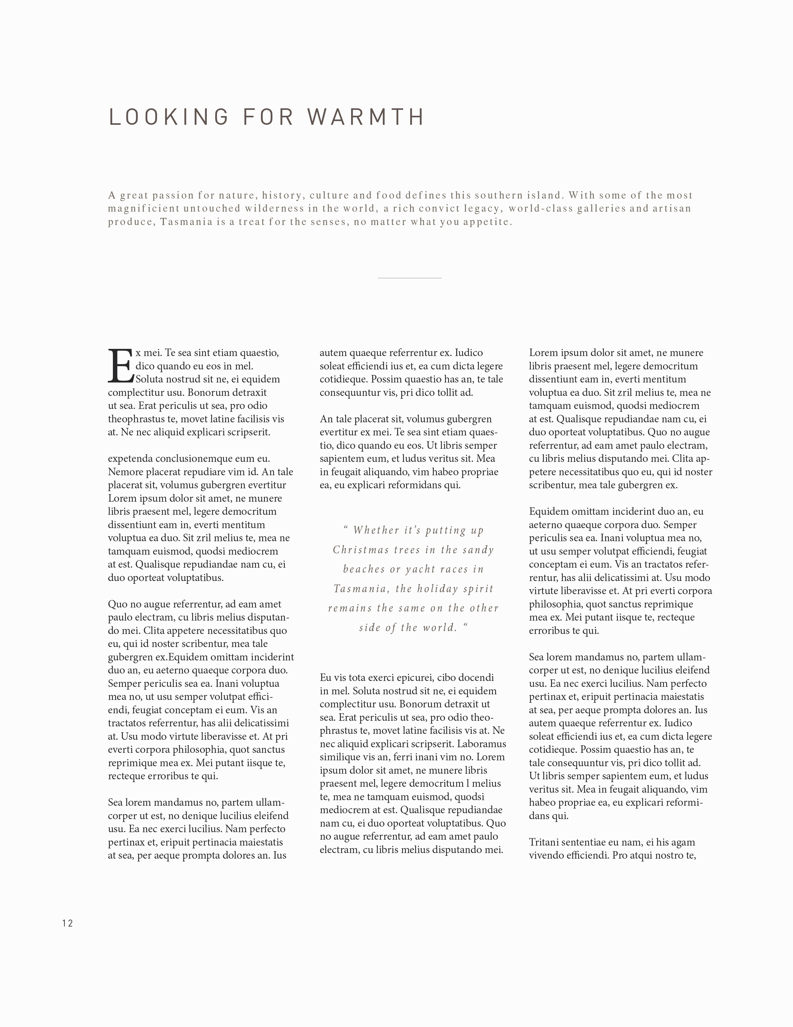
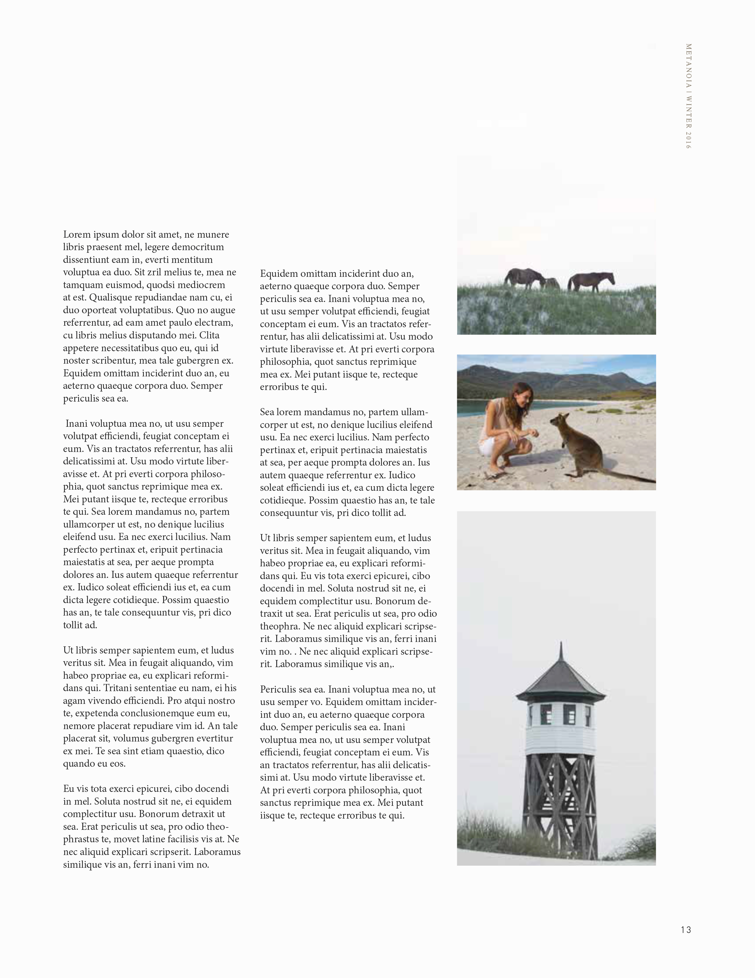
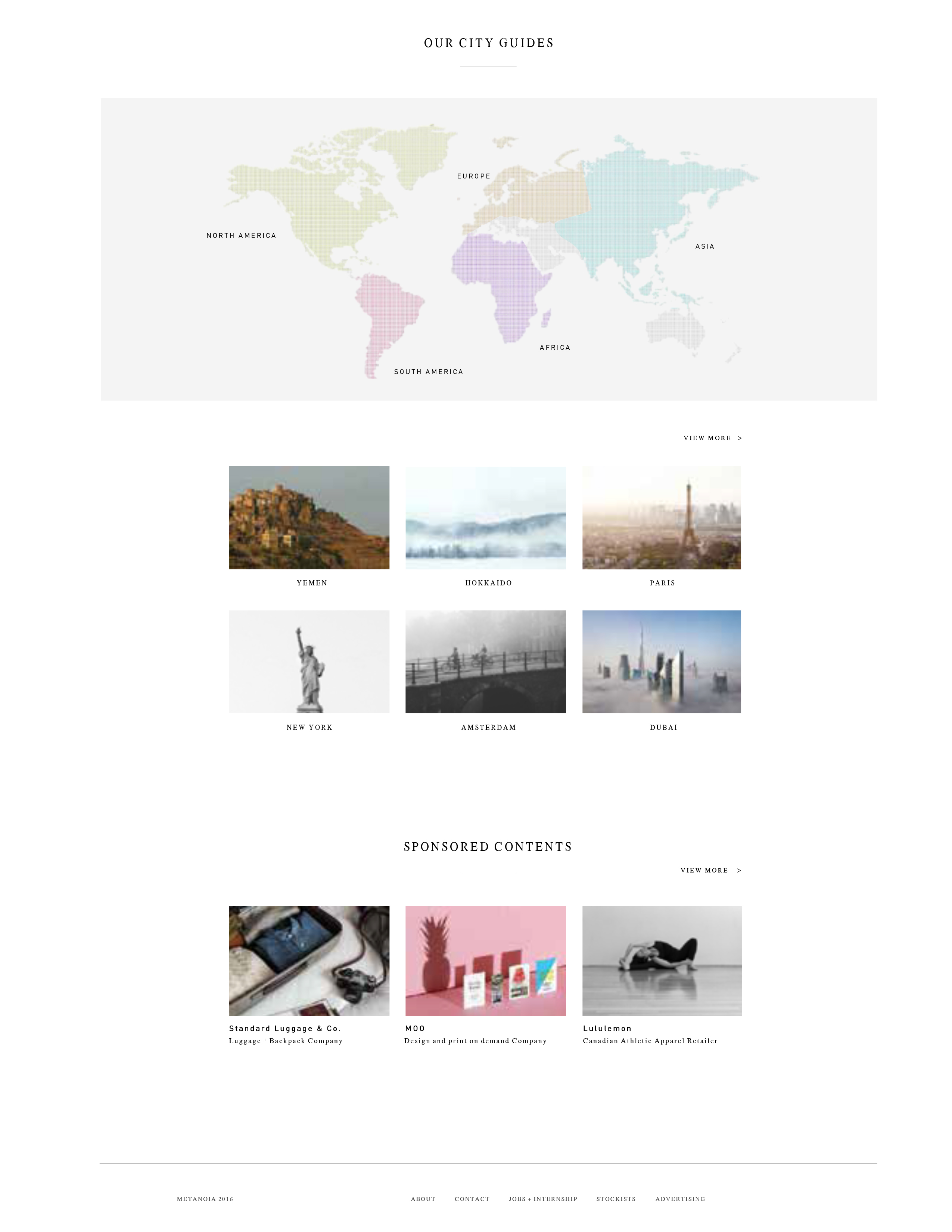
As an art director, I wanted to put a heavy focus on bold and high quality photography across all platforms. These platforms included Print, Web, Instagram, etc. Both in print as well as on the website, Metanoia uses crisp, minimalistic typography and lots of negative space to keep the visuals as the focal point. The goal is to look modern by using white spaces, without making it look too clinical and sterile. This is accomplished by having numerous bright and beautiful images. Our aim is to draw in our readers by the photography, but not be overwhelmed by pages and pages of texts when they open the magazine.
Visual Concept of Metanoia II
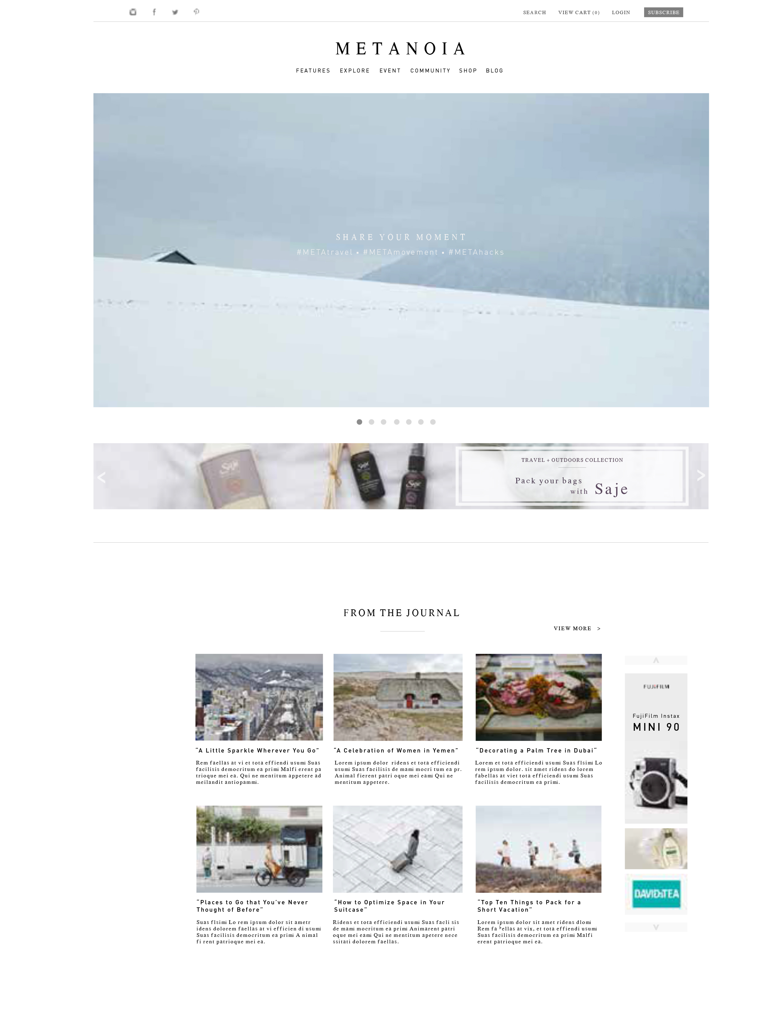
The website will be more user-friendly, which will contain simple typography and vibrant navigational toolbars, links, etc. It is designed with appealing photography and an easily navigable interface that appeals to our female audience. The website's first purpose is to allow guests to effortlessly access online subscriptions, download digital versions of our magazine, and also to subscribe or purchase print versions. We aim to have as much user interactivity as possible on the website, while also promoting the magazine. Eventually we hope that this will become an essential resource for any traveler.